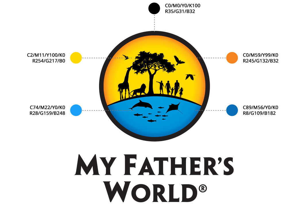
My Father's World
Despite being one of the oldest and largest publishers of homeschool curriculum with a passionate following and an exceptional product line, My Father’s World had a strong desire to enhance their brand image and shift some of their marketing budget to faster growing and more cost-effective digital marketing methods.
Building the Brand
Formalizing the Message, Look, Imagery & Design
Like many small businesses, MFW’s marketing was a “hodge-podge” of messages and designs accumulated over the years from a variety of different in-house designers, freelancers and others. Our first step was to understand MFW’s business – its market, its customer, its competitors, its goals – so that we could develop its brand standards and then develop formalized brand guidelines to guide everyone involved in sales and marketing.

Updating the Catalog
Creating a Consistent Look, Feel and Message Throughout
While the world has become more digital, many MFW customers still love the company’s print catalog so we enhanced these along with other print pieces with the new Creative. New imagery was employed to provide a better feel for the curriculum’s content and how it can truly helpchildren “See the World Through God’s Eyes” – My Father’s World’s primary goal.

Enhancing the Website
www.mfwbooks.com
My Father’s World primarily sells directly to its customers through its website and call center, but its existing website was mostly functional in nature. While customers could order easily, it lacked the design and messaging to educate new customers and deliver its powerful message. We worked with MFW to develop their primary selling points, create new messaging and then enhance the look, SEO and navigation of their website with a focus on continual improvement.


